Let's talk about sharing. The default sharing Bottom Sheet on Android is absolutely terrible. You'd have to try hard to come up with something worse.
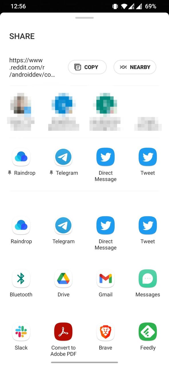
Look at the screenshot. Keep in mind that by default it shows at about half screen, meaning you need to use the upper part very carefully, save space for important things. What do we see?
- Large SHARE title, taking up about 10% of height. Funny, but it even stays when scrolling down, apparently it's very important to always keep on screen.
- Text that I'm sharing - it to put it mildly doesn't fit, even though there are 100 characters maximum. I don't even have the ability to tap somewhere to see it fully.
- Next to it Copy and Nearby buttons. If you want to share a picture, there will only be Nearby here. That's another 10%.
- Then some frequent contacts, according to the logic, right? There's one person from Twitter DM, two of my own emails and a random Discord channel (where's the icon, Discord?). I bet I've never shared anything with them in my life. Really frequent contacts - not a single one here. This is about 15% of height.
- Then a block of frequent ones, apparently. Praise the gods you can pin some actions. In unpinned slots, at first glance, actions are random. This is the most useful block of what I've mentioned so far.
- Below the same exact row. What? Yes. The same 4 actions that are frequent.
- You can't see this in the screenshot, but starting from this place all content below loads after the bottom sheet is shown to me and therefore there's flickering of all icons in turn.
- Then just a list of all other available actions. Any guesses in what order they go? I just don't know. How to search for the action I need?
I don't know. My way - copy text, and attach files already from the app itself, I'm too old to use this dialog.
I fully admit that some points are relevant only for my device (OnePlus 6T) and Android version (11). But with a quick look at the emulator and Pixel 6A with 13 - the picture is very similar.